For my project I chose to make an opening sequence of a film. We called our film ‘fixed on you’. We did our project in groups. My group consisted of myself, Grace, Lauren and Luke. We all shared out equally the responsibilities of the project so filming directing and editing were done by all equally! Overall we wanted to be able to relate to our opening sequence and also be 100% happy with our work and effort! The genera we choose to show this was Romantic Comedy we chose this because we felt that more people would relate to it and also be attracted to it.
We choose romantic comedy for a reason we had a think between us all and none of us really wanted to do a horror or anything like that we wanted to do something that was easy going and enjoyable! Also easy for the audience to understand but would also get them thinking! Our opening sequence has everything in it that a normal opening sequence would have in it, it introduces the characters and also the main settings and the way the characters come across to the public we use cinematography by changing the camera angles and shots to emphasise the difference between the two characters. To show the romantic comedy in this opening sequence we chose the fact that they were going on a blind date you can see that they are going on a blind date by the texts they are sending and the fact that he is called ‘Mystery Man’ this is as she doesn’t actually know the name of the character. The comedy side of the of the opening sequence is created by how the character Luke looks he looks like a geek and the character Gemma looks far from this and is also emphasised by the way they are both dressed. Luke also looks funny by the way he is dressed it’s all very over the top and there wont be many people that actually look like that. We also challenged the genre by both the characters walking past each other as this is unexpected it also shows they don’t know each other at all and not what a normal romantic comedies show as the characters are normally exactly the same and one of them already has a crush on the other but in this film they wont fall in love till the end of the film we create this by the two different shots of the characters then comes into one long shot showing both of them. We also used other types of media language to show the opposites between the characters we use mise en scene by showing the bedrooms and how different they are as Lukes is very organised and tidy and Gemmas is very messy and unorganised. Lukes bedroom also shows the geek look even more by his room being as tidy as it is. It also shows the more rebel side of Gemma by her room being so messy it gives her the cant be bothered aprocech to life like a rebel would have. Using our feedback sheets everybody said that our opening sequence was a romantic comedy so we feel like we did a very good portraying this, they also said they wanted to watch more of the film, so this makes me feel like we were 100% successful with our work!
Our opening sequence represents young people getting ready for a date by doing jump shots we show them both getting ready at the same time which keeps the audience remembering both the characters. Our two charecters are very different as the girl character is potrayed as a reble quirky, stylish character as her costume attire was riped shorts, purple socks over black tights, pumps, lepord top, patched shirt, black cardigan and a green mac, her makeup was very over empersised and her hair was made very scruffy and messy. The male character is a stereotypical geek. We portrayed this by him wearing a tweed suite, newly polised shoes, big glasses with tape holding them together, a big woolly hat and scarf. The way they are both dressed emphersises the difference between them and also shows based on aperance you wouldn’t put them together. This was the whole aim of our opening sequence to make them as oposite as posible so then there would be more of a shock as they got together later on in the clip.
We wanted our film to appeal to an audience aged 15 and above by the reaction we had on the questionaires we seemed to do this as everyone stated that the film would be aimed at young adults. The reasson for us aiming it at this audience was becasue we didnt think that the older generation would be to interested of teenage love and oposites where as teenages and young adults thrive off love and romance especialy when there is a catch to it. When we did research into what we were interested in going to watch at the cinema romantic comerdy came out on top so this means that bringing another film out which is of this genera would mean that it would be bringing in a good boxoffice and would have more chance of sucseading than another genra at this moment in time.
These images below have been cut from our opening sequence and they show the types of media language and also the type of feeling we are trying to protray.
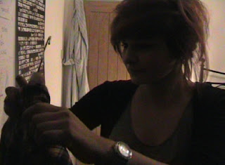
At the beginging of the opening sequence we use an image og gemma (on the right in the image above) opening her wardrobe but we then use a jump shot to change to the exact same shot but in lukes wardrobe (shown on the left) we throught this was a cleaver way to show the two charecters in the same light doing the same thing and both concentrateing on what they are going to wear we also throught that it is a cleaver way to introduce both of the characters so that not one of them gets forgoton they both share the limelite. On most of out images we used natual lighting we chose this as we throught it would give a natual effect and also make the audience believe more easily that they were part of the film. Also througout the film we used non digetic music that went along and also told the story for us the charecters cant hear the music only the audience and the audience cant hear the charecters. the best way to describe how the song was used is basicly by the line 'there was a boy and girl who fell in love' so this tells you what is going to happen but also in the song there are plently of obsticals along the way.


The images above both show luke and gemma coming out of there homes we yet again chose jumpshots to flick from one image to another we also chose to shhot it on the lines so it kept the audience focosed on diffrent points and didnt look like the same shot.
The images above show two shots of both characters walking past eachother. The whole point of this shot was to show the audience that they lived so close to eachother didnt know eachother but yet they were about to meet and later on fall in love and it is totaly unexpected. Also with these images it shows the oposites of the characters more clearly as they are both in the same shot as you can see gemma is smokeing and looks reasonably scruufy and the character luke is very neatly dressed and wraped up.
This final image is the title image this image we chose to keep it plain and simple so that the audiene can clearly see the title of the film without being distracted. We chose the font so that it makes the clip look more hand done and not so perfect like on all the other parts not everything is neat and tidy.
Overall I am incredibly pleased with the outcome of the opening sequence! I think the way that the characters were portrayed very well as Luke as the geeky on and Gemma as the different more daring character! I think it also showed the opposites very well by using the cut editing from flipping from one clip to the other. I think if we had made the character Gemma more daring it would have been more distinct. Also it would have stood out to the audience more! We ended up takeing out alot more that we filmed the reasson for this was to make sure that we kept it short and sweet and also to the point. This project has made me realsie how much work actually goes in to makeing a film and how much time and effort it takes up. I am very happy with the overall outcome of the opening sequence and i really wanted to carry on and make the film.
Gemma x


